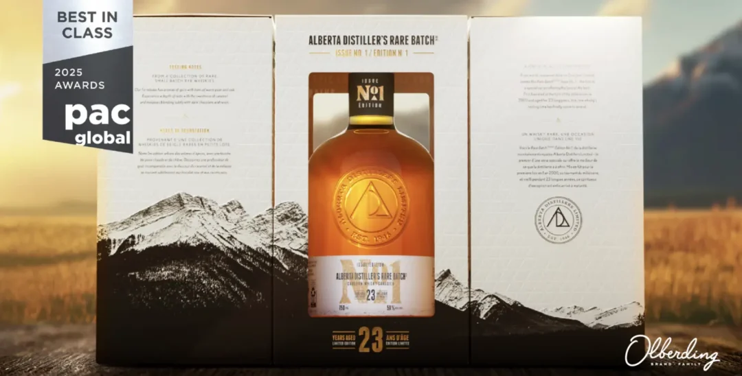


Packaging is far more than just a container in the world of premium whiskey. It’s an experience, a story, and a tribute to craftsmanship. When our team was tasked with designing the packaging for Alberta Distillers Limited (ADL) whiskey, we knew it had to honor the brand’s heritage while enhancing its presence on the shelf. The result? A design that seamlessly blends artistry and production excellence, inspired by the breathtaking landscapes of the Canadian Rocky Mountains.
Alberta Distillers Limited, renowned for its award-winning portfolio of Canadian whiskies, approached us to create the packaging for a unique collection of premium small-batch releases. Unlike their established brands, these whiskies would be marketed directly from the distillery. The first release in this series, Alberta Distillers’ Rare Batch Issue #1, would set the tone for a new chapter in ADL’s legacy.
This packaging design was crafted to embody a distinct “sense of place,” capturing the Canadian Rockies’ rugged beauty and the product’s premium nature. By strategically using a combination of imagery, structure, and printing effects, the packaging tells a story of craftsmanship and the environment from which it originates. The sides of the carton feature photography of the very peaks surrounding ADL’s distillery, creating a visual journey that wraps around the packaging. An open window allows consumers to see the bottle, symbolically pulling it from the mountains from which it came.
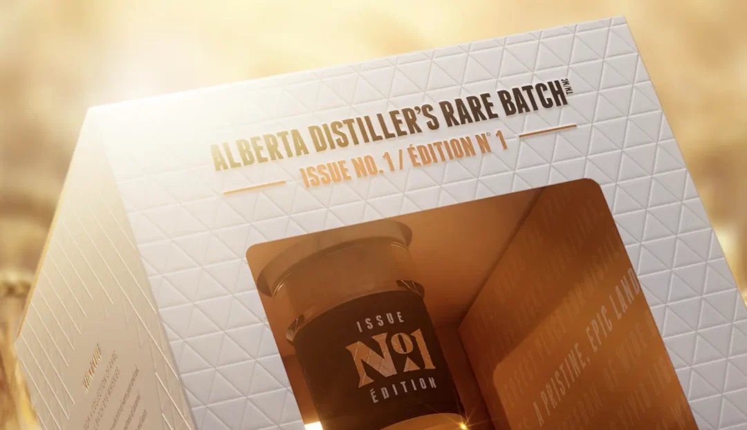
The limited color palette and rugged photographic style resonate with ADL’s core values of resilience and hard work. Premium embossing adds depth and texture to the mountains, providing a unique tactile experience that invites engagement. A triangular pattern—blind embossed onto the exterior—echoes the ADL logo and helps create calm spaces for storytelling on the sides of the package. Meanwhile, juxtaposed with the clean black-and-white exterior, the striking orange interior ensures visual intrigue at every step of the unboxing experience.

As Beth Triantos, Brand Director, shares: “It was a privilege to collaborate on this premium whiskey project, where every detail was meticulously considered by all involved. The thoughtful design and strategic leadership truly shine through in the final result. Great design begins with great listening. By truly understanding our client’s vision, we crafted a design that met and exceeded expectations, creating a beautiful, engaging, and lasting impact.”
What makes this project truly special is how it celebrates a “sense of place.” The ADL Whiskey brand is deeply rooted in its Canadian origins, and our design reflects that connection. Every texture, finish, and subtle detail was purposefully chosen to tell a story of craftsmanship and regional pride. This resonates not only with the client but also with whiskey enthusiasts who appreciate the depth of the brand.
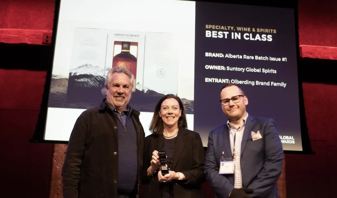
Collaboration was a cornerstone of this success. Our design and production teams worked hand-in-hand to ensure every packaging element translated flawlessly from concept to reality.
As Chris Gajus, Creative Director, explains: “Our team values conceptual storytelling because we believe it results in solutions that are fundamentally imbued with more meaning. Alongside our client partners, we strive to make that meaning tangible to our customers so they can interpret and build upon it in their own ways. A sense of place can be many things, and for ADL, it was really about how the landscape defines their process, product, and perception. It shapes everything, so it was naturally a powerful connection we wanted the package to embody.”
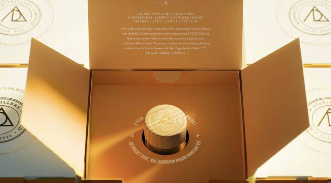
This project is a testament to the power of thoughtful design. It’s more than just a label or a box; it’s a tactile experience that invites consumers to connect with the story behind the spirit. As brand stewards, our role is to create work that does more than look stunning. It also deepens the relationship between brands and their audiences. We are proud to have achieved just that with this project.
This collaboration spanned multiple internal teams at Olberding Brand Family, including design, 3D CGI, and premedia, all working together to bring the vision to life. We ensured every printed element and embossed detail was visually captivating and perfectly executed in the final product. From the intricate design nuances to the precise execution of special print finishes, the result is a premium packaging experience that genuinely reflects the quality and authenticity of Alberta Distillers Limited’s whiskey.