

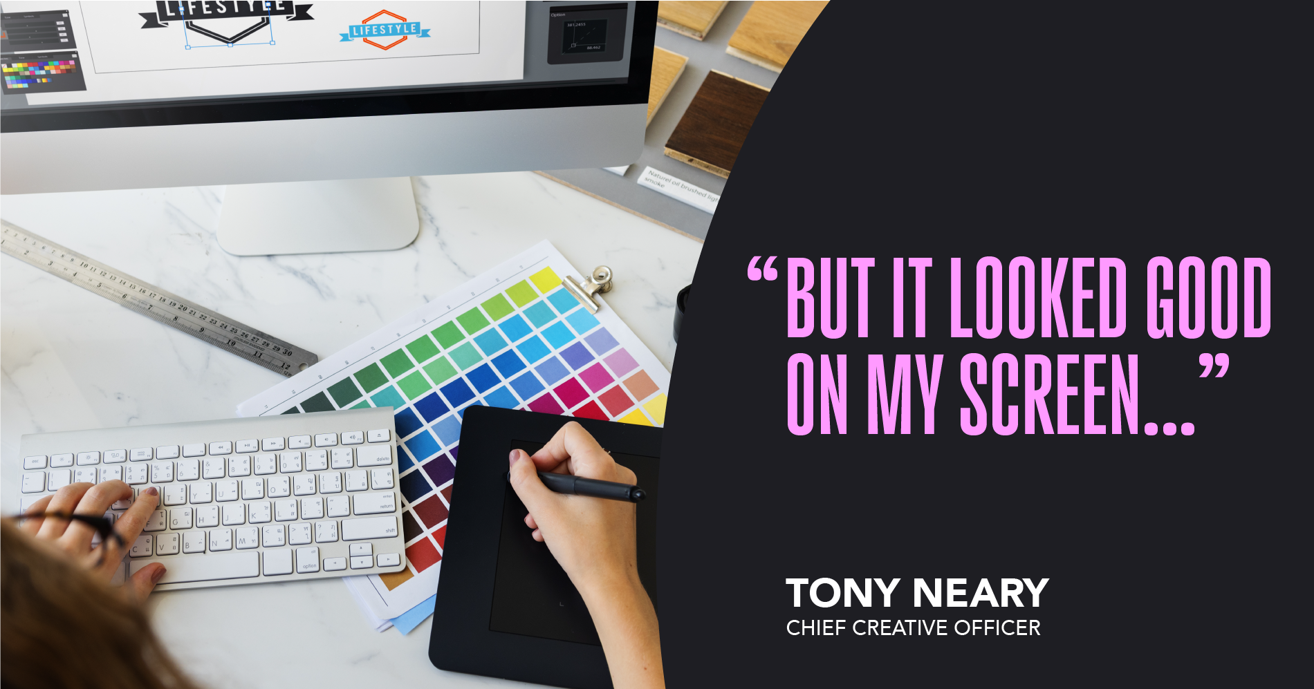
Many years ago, when I started my career as a young designer who didn’t know any better, I must admit, I said, “It looks good on my screen, but it didn’t print that way.” If we’re being honest, I think we can agree that even the most seasoned designers and brand owners among us have been guilty of saying something similar at least once before. Since computers first arrived on the design scene, it’s been an ongoing challenge to achieve finished results that fully and accurately reflect the design on the monitor.
You don’t still say that do you?
Now I don’t want to get too technical about it but there’s a good reason for this: RGB is not CMYK. (For starters, even the number of letters is different!) Most critical, of course, is how colors are composed on a monitor and how they are created on press. Because RGB is an additive color model and CYMK is a subtractive color model, colors in printed pieces can appear less vivid than they do on the screen.
But before we ever give up on finding common ground between monitors and printed pieces, here are some considerations that can help bring sanity and clarity to any project:
• My most important advice is to align on a single version of the “truth” for your brand color(s) and review existing work with an eye toward outliers and discrepancies. Is your “true color” how it appears on a poly bag? Maybe it’s when it’s printed on paper…or on corrugated board. Possibly, it’s when it appears in e-commerce as a digital image. Reaching a consensus—and making sure everyone involved is using the same reference as their guide—is crucial to creating the results you want.
• Decide how much collaboration there should be between the design team, the production team, and the printer. Good communication throughout the process can help shortstop any issues or irregularities that arise. And don’t be afraid to tap into the expertise of the “color ninjas” on the production team early on—they understand the range of technical details that can mean the difference between a “miss” and success.
• Test on multiple substrates to determine what it takes to ensure color integrity across a spectrum of applications.
• If printing will occur at multiple locations, odds are that all the presses will NOT be calibrated identically. Rely on your pre-production team for recommendations on making adjustments that can help you achieve consistent color across all printers.
Some may ask, ‘What’s the big deal if the color is a little off?’ Well, color that looks faded or “off brand” can erode equities, cost a sale at shelf, and potentially lead to a glut of otherwise good product having to be donated or ending up in a landfill.
By working collaboratively to achieve a single version of the truth, you can protect your brand image while always putting your best foot forward.