Project Details
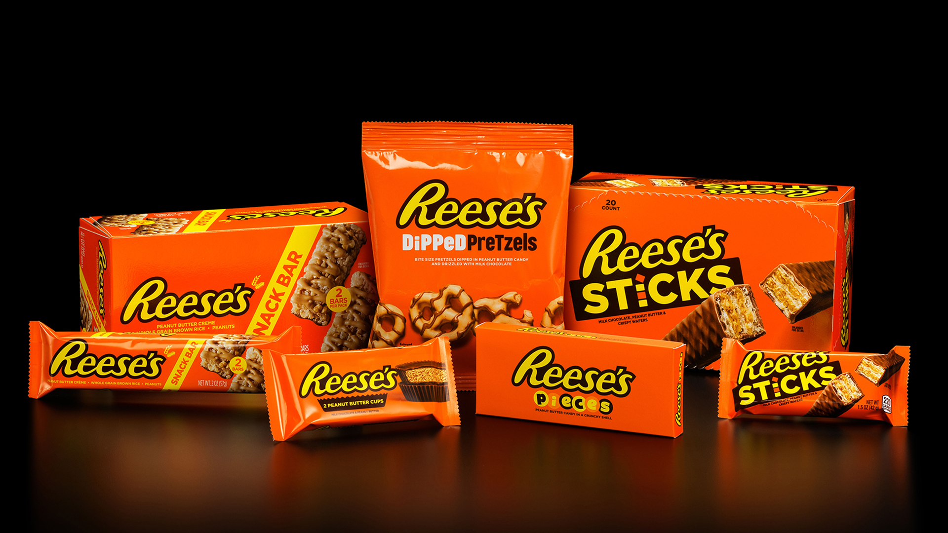
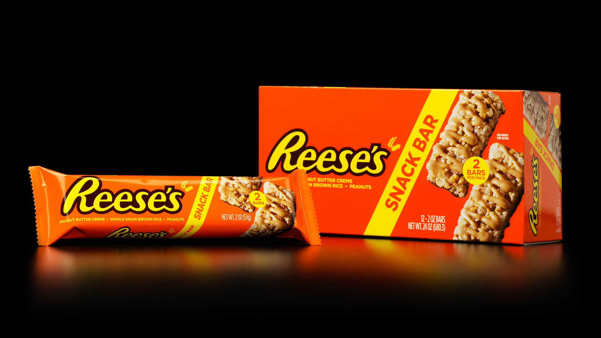
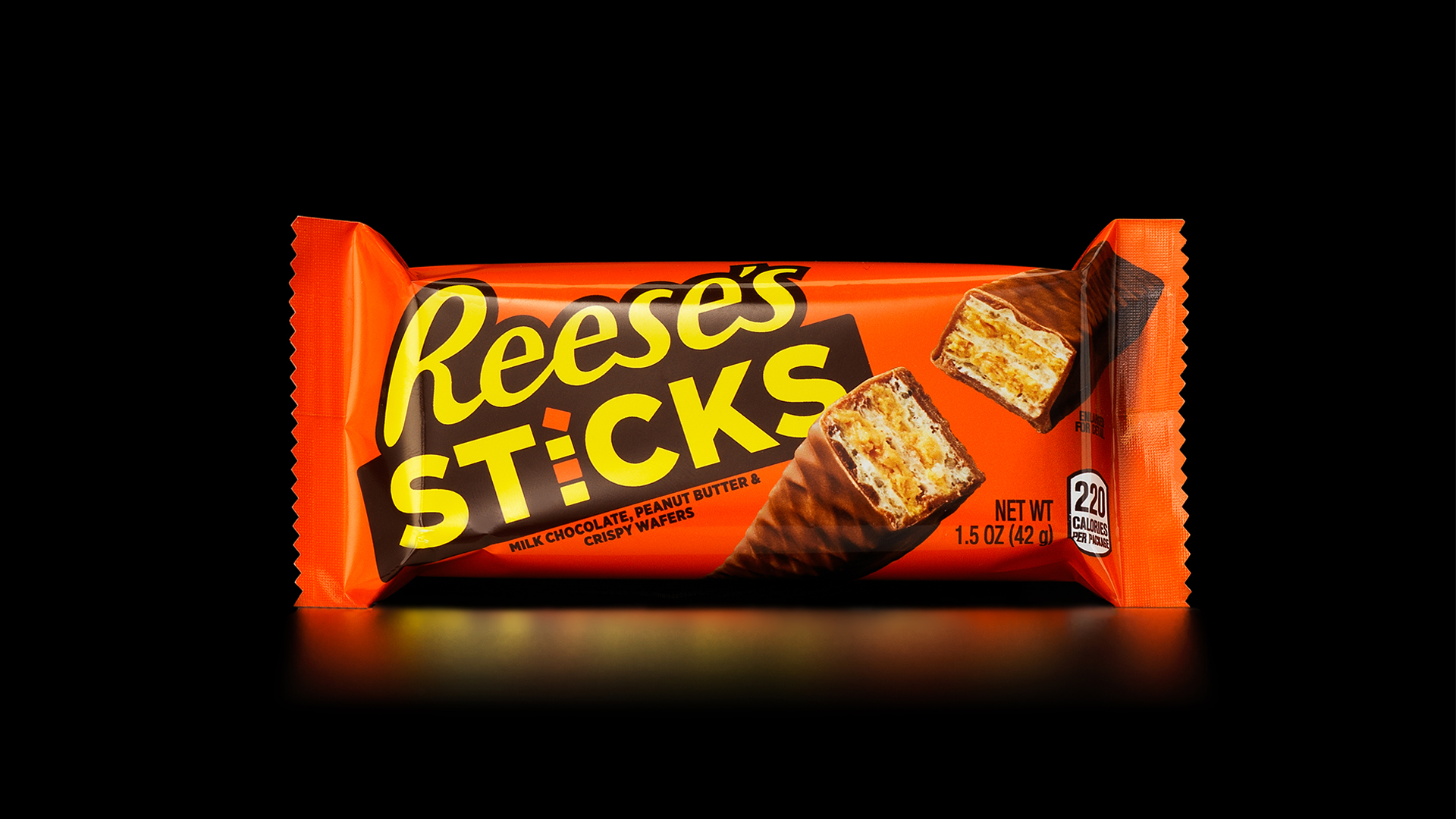
Hershey wanted to preview its updated Reese’s design system to ensure consistency across various forms and sizes. We handcrafted color-managed comps across cartons, pouches, and wrappers, making sure every SKU correctly reflected the aligned design intent. Most importantly, we wanted to make certain that the most iconic orange in the candy aisle remained spot on across all substrates. The result? A bold, vibrant, and unified brand impression that keeps Reese’s looking as sweet as it tastes.
Offerings
- Production Art
- Prepress & Repro
- Retouching & Color Correction
- Stepping
- Plate Files
- Packaging Mockups
Client: The Hershey Company
Brand: Reese’s
Sector: Confections